
The color management preferences in FreeHand give you three core systems to work with, and each gives a different level of color management to meet your needs. Let’s look at each of these systems of color management and point out advantages of each.
Adjust Display Colors (works best for me)
The Adjust Display Colors system of color management is simple to configure and allows each person to adjust the monitor to the color perspective that they perceive. This is also the recommended method of color management by a large number of designers and artists in the FreeHand community.
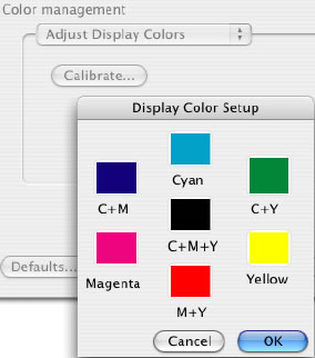
Adjust Display Colors allows us to adjust the primary and secondary colors as we perceive these colors on our monitor. As a guide to make the adjustments you can use a printed sample from your printer or even a Pantone color book. Now let’s look at the steps to configure the Adjust Display Colors.
Preparation for configuration
Open a new FreeHand document
Create a 7 boxes that are 72 pixels square
Using the CMYK Mixer, fill each of the boxes with one of the following color specs.
100 C
100 C + 100 M
100 M
100 M + 100Y
100 Y
100 Y + 100 C
100 C + 100 M + 100 Y
Print this page to your color printer
Configuring the Adjust Display colors
Open the Preferences and select the Color Tab (Win) or Color Category (Mac)
Select Adjust Display Colors from the Color Management pop-up menu
Select the Calibrate button
Double click the color swatch for Cyan
Using one of the color selection methods, adjust the color on your screen to match the 100 C sample on the print out that was created earlier
Repeat steps 4 and 5 for each of the colors swatches.
Color Tables
This system of color management has very few options and only controls the conversion of color between RGB and CMYK color models. With this system you have two options for controlling the display of color on your monitor.
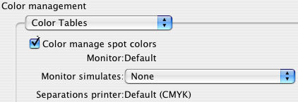
Color Manage Spot Colors allows you to specify if spot colors (Pantone Solid for example) are adjusted to the option that you have specified for Monitor Simulates. Another way you can think of this is that with the option off, the spot color is represented as an RGB color. With the option selected, the spot color will be displayed as if the color was printed in CMYK.
Monitor Simulates is the option that will allow you to simulate None or Separations printer. Once again this basically defines whether the colors are displayed as RGB (None) or as a CMYK printer would reproduce the color (Separations printer).
Kodak Digital Science/Apple ColorSync™
By far this is the most complex system of color management by allowing you to specify profiles for your monitor, printer and even a scanner. One draw back to this is that the manufacturer provided profiles needed for this method of color management are not as accurate as they need to be.
Generally a profile that is made by a monitor manufacturer is a sampling of colors for a broad selection of monitors and not specific to your monitor. We have all been to the electronics department of a store selling TVs and have seen the inconsistencies of the colors shown on the screens of the wall of TVs. This same issue happens with computer monitors and can be inaccurate for your monitor. And this is why the manufacturer provided profile might not be a good match for the state of your monitor.
There have been products on the market that allow you to sample a small selection of colors and build a profile specific to your hardware. While this can produce acceptable results for some people others will find this not as precise as could be. Generally, a good quality profile will sample thousands of color in order to be the most accurate. Then it must be recalibrated regularly to adjust for the changes in the monitor based on a number of environmental variables.
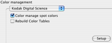
In the main screen of the Kodak Digital Science we find the following options.
Color manage spot colors – allows you to specify if spot colors (Pantone Solid for example) are adjusted to the option that you have specified for Monitor Simulates. Another way you can think of this is that with the option off, the spot color is represented as an RGB color. With the option selected, the spot color will be displayed as if the color was printed in CMYK.
Rebuild Color Tables – This option allows your override the default color tables that are built in to FreeHand. Once this option has been selected you will need to further configure this system of color management to match the Monitor and Printer that you are using.
Now let’s take a look at the configuration settings and define what these settings do.
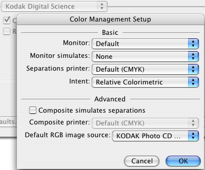
Basic
Monitor – This pop-up menu allows the specification of the monitor being used. If your monitor is not listed, check with the manufacture of the monitor for an available profile.
Monitor Simulates – This option allows the specifying of how the monitor represents the colors ether as a Composite or Separation printer.
Separation printer - This pop-up allows the specification of the type of printer that will be used. This allows defining the type of printing press that will be ultimately used for printing.
Intent – When colors are converted from one color model to another there are times that accuracy may need to be sacrificed to allow for a more accurate display of the color. This option can be set relative to the type of objects that will be printed. Lets define each of these now.
Perceptual – This is the best choice for photographic images
Saturation – This is the best choice for colorful artwork such as graphs, charts and presentation
Absolute Colorimetrics – This is the best choice for matching logo colors
Relative Colorimetrics - This is the best choice for illustrations
Advanced
Composite Simulates Separation – This option goes one step further and allows the printed output for a composite printer to approximate the output of a separation printer. Once this option is selected, the selection of a separation printer will be needed.
Default RGB image source – This option allows definition of the default that will be applied to all images when imported into FreeHand. So if Kodak Photo CD images are regularly imported, then it can be specified. This default will be visible in the object panel when an image is selected.
Troubleshooting CMS issues:
Troubleshooting the CMS is straightforward, and now that you have a basic knowledge of how it works and what the settings are, troubleshooting will be much easier.
First, you need to have a good frame of reference when troubleshooting problems. You need to know what the colors should actually look like. Here is where a good printed color selection book will come in handy. Pantone is a good provider for these books. To see what is available, visit www.pantone.com.
An example of this type of issue: a color in FreeHand looks different than the same color in Quark XPress. Which color is accurate? Here is where that Pantone color book will come into use by allowing you to see what that color looks like in a printed example.
Second, consistency in the configuration of the CMS between applications is vital. A common question for Technical Support is why FreeHand displays an image muddy compared to Adobe Photoshop, where it looks great.
Generally by simply setting the CMS in FreeHand to “None” allows the image to display as it did in Adobe Photoshop. Note that doing so will likely result in a shift in color when printing the image from FreeHand.

