Page 1 of 2
Logo Design for Gubbi Labs
Posted: Tue Feb 02, 2010 9:37 pm
by antzfx
The other day I got a chance to design a logo for Gubbi Labs. This is what I came up with:

To know about the thoughts behind this design and also to see the other options submitted to the client, please visit:
http://fullfx.antzfx.com/2010/02/02/des ... ubbi-labs/
I really liked the outcome. Any comments? The space below is all yours.
Re: Logo Design for Gubbi Labs
Posted: Tue Feb 02, 2010 10:38 pm
by pixelfiesta
Its Pretty! But I think the sparrow could be simplified and so the fonts. Bauhas is a age old font. Anything from the non-serif like the Helveticas or Univers would have still worked
Re: Logo Design for Gubbi Labs
Posted: Wed Feb 03, 2010 12:21 am
by antzfx
@pixelfiesta:
Thanks for the tip on the font selection.

Re: Logo Design for Gubbi Labs
Posted: Wed Feb 03, 2010 12:40 am
by Saumya
i agree with pixelfiesta. try a font like this (used Helvetica Neau Medium and Extra Light). At least it looks more modern.
Re: Logo Design for Gubbi Labs
Posted: Wed Feb 03, 2010 12:55 am
by pixelfiesta
What about the sparrow, Saumya? Shouldnt it be simplified too?
Its mid-night and I am too lazy to experiment like what Saumya did. But if you could post a vector, people could give their suggestions/ version. Hey thats infact a nice way of getting more options for your future revisions. Wanna try, AntFX?
But least of it try removing the black outline from the sparrow and replace the grey with some other shade of brown? May be a biscuit-brown or a beige... I will conclude by saying, you are only 70% there in terms of the final look according to me.
Hope you take my criticism positively, AntFX.
Re: Logo Design for Gubbi Labs
Posted: Wed Feb 03, 2010 11:00 am
by antzfx
Looks like I have to share the money with Saumya and Pixelfiesta!

Thanks a ton.
@Pixelfiesta: I *am* looking for criticism, that is the only way to improve things. I believe that 'design is highly personal.'
In my defense, I can say only the following:
1. One of the thrills in design is interpreting the unstated/implied requirements from a client and putting them in black and white. The client approached me with the following picture as a sample. They didn't directly use this image as logo because it is copyrighted.

2. Among the first three options I submitted (see the blog entry), I liked the following:

When the client rejected them telling that "it is just a bird, not a sparrow," I went back to the drawing board and generated the present logo by giving it an illustration look (hence the black outline) and giving the exact colors of a sparrow so that it can be recognized easily.
I infer that since it is closer to the original image supplied by them, they accepted this version immediately.
3. Regarding the font: Ah, I don't know how to explain it; let me try.
The strokes of the font Bauhaus do not touch or cross one another. Compare the alphabets 'g' and 'b' in Bauhaus and Helvetica. To me, that appeared as free flowing. But what if they do touch? I don't know. Maybe, while selecting this font, I was thinking of a bird perching on a tree branch.

Re: Logo Design for Gubbi Labs
Posted: Wed Feb 03, 2010 12:20 pm
by Saumya
i like the one you illustrated under 'Option 2' better. But I know how idiotic clients can get.
still the idea of a logo is that you should be able to print it in silkscreen in as few colours as possible and it should render well in black and white. does this one?
Re: Logo Design for Gubbi Labs
Posted: Wed Feb 03, 2010 12:50 pm
by pixelfiesta
I also like the one under Option 2.
But as Saumya said, a little more simplified so that you can screen print it. First render a logo in B/W
A logo ideally should look its best in B/W and then in colour
Re: Logo Design for Gubbi Labs
Posted: Wed Feb 03, 2010 1:22 pm
by antzfx
Hmm... I am aware of the screen printing and monochrome requirements of a logo. Proof?
http://fullfx.antzfx.com/category/logo-design/
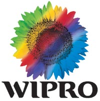
One interesting incident happened some time back: I was trying to convince one client against using a gradient on a logo. I gave all the right reasons like problems in printing on a carton box in monochrome. His reply was "If WIPRO can do it, why don't I?"
Re: Logo Design for Gubbi Labs
Posted: Wed Feb 03, 2010 5:09 pm
by pixelfiesta
This is one example. But have you seen how Wirpo logo looks like in B/W
Infact I find it quite awful. They dont use it much!
Ask your client how often do they see a b/w version of the Wipro Logo?
Ask someone who knows created this logo and how his approach to work is!
Re: Logo Design for Gubbi Labs
Posted: Wed Feb 03, 2010 7:49 pm
by vikas
the Wipro logo (which I hate by the way) was designed by Sambit R. Sengupta of Strategic Shining Design, Paris. His firm has also designed the Britannia and Parachute logos.
The poor guys at Wipro, will never be able to use silk screen to print their logo. They will also never be able to use their logo in line art.
ask your client if he wants to go through the expense of using 4 colour offset to print all his branded items for the rest of his logo's life: business cards, letterheads, envelopes, note pads, presentation folders, t-shirts etc.
if he/she agrees, then have a secret pact with a friendly printer, take a small cut, and make money for the rest of the logo's life
Re: Logo Design for Gubbi Labs
Posted: Fri Feb 12, 2010 8:51 am
by antzfx
I just saw the new logo of Dhanlakshmi Bank.

The design is done by
FITCH, a WPP company. If I am right, they have used Century Gothic font. The distinction between the two parts of the name is brought out by using a very thin version of the font for
'Bank.'
Re: Logo Design for Gubbi Labs
Posted: Sat Feb 13, 2010 2:26 am
by pixelfiesta
I am surprised Dhanlaxmi Bank went to Fitch.
And I am also surprised Fitch did that logo.
Doesn't look all that great. I wonder if it was not possible to be done by an Indian design firm.
By the way AntFX, I dont think its Century Gothic. The 'h' and the 'l' dont look like that of CG, unless they chiseled the tops of these two alphabet.
Re: Logo Design for Gubbi Labs
Posted: Sat Feb 13, 2010 7:29 am
by antzfx
@PixelFiesta: Yes, you are right. Even the
'k' of
'Bank' is different from that of CG.
The FITCH story is
reported by afaqs!
@vikas: Just found a 2005 interview of
Shombit Sengupta in which he talks about the design ideas behind the 'Rainbow Flower' WIPRO logo.
The brightness of the 'Rainbow Flower' would manifest the corporation's value of integrity, while the rainbow's fresh appearance after the storm would reflect human values.
Everyone can relate to the rainbow because it's in nature. It's rare, but when it appears everyone can see it. This simplicity and rareness would comprise value for money. The central part of the flower denoting digital complexity would reflect the value of innovative solutions.
Customer interactions through research confirmed that Wipro's identity made the corporation into a young, vibrant diversified group with a single personality.
Read the interview
What's behind Wipro's 'flower' logo here.
Re: Logo Design for Gubbi Labs
Posted: Sat Feb 13, 2010 9:33 am
by Saumya
whatever crap they may say to sell teh logo, it is still lousy!